
Scope
Introduction
Brochure Design
Editorial
Illustration
I had the pleasure of designing a brochure for SEAMI, which stands for South East Asia Music Institute. This innovative music education centre is dedicated to sharing knowledge and enhancing the musical aesthetic of the community. The brochure showcases the programs and services offered by SEAMI and provides an overview of the institute's values, philosophy, and approach to music education.
SEAMI is more than just a music education centre - it's a community that seeks to connect people through the power of music. Their mission is to spread happiness and enhance the quality of life for everyone who experiences their programs. Through the brochure, I aimed to capture the essence of SEAMI's mission and inspire readers to join this vibrant community.

The Idea
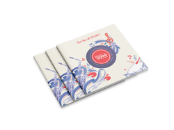
My vision for the SEAMI brochure was to create an immersive experience for the reader, reminiscent of the nostalgia and warmth of listening to a vinyl record. By incorporating design elements that mimic the look and feel of a vinyl record, such as circular shapes and grooves, I aimed to create a sense of familiarity and comfort that would draw readers in.


The Process
I incorporated music festival elements such as confetti, music notes, and ribbons, along with images of musical instruments, to create a brochure that resembles a vinyl record and evokes the feeling of attending a festival.


The color
The brand's colors, lighter shades of blue and red, were used throughout the brochure design.


Music notes
Ribbons
Confetti
Shapes
The Illustration
The illustration features festival elements, shapes, and music notes.


 |  |  |  |  |  |
|---|